Texture is the part of the look nobody teaches.
Composition gets the books. Color gets the LUTs. Texture gets a shrug and the word grain. It is the layer the audience feels with their hands and never points at. Learn it last. Notice it first.
The part nobody teaches.
Here's the thing. You can find a hundred breakdowns on composition. You can find a thousand on color. Try to find a serious one on texture. It is the quietest part of the look and it does the loudest work, and almost nobody walks you through it on purpose.
Watch how people talk about it. The colorist Jill Bogdanowicz put it plain. When people say texture, they usually just mean grain. That is the whole conversation for most of the industry. Grain. End of thought. But grain is one ingredient. Texture is the whole dish.
Go back further than any of us. There was a painting idea, from a guy named Berenson, called tactile values. The idea was simple. A great painting does not just show you a thing. It makes the thing feel touchable. Your eye believes your hand could land on it. That is texture. Not a filter. The reason a flat image stops feeling flat.
Look at it this way. Composition is where you put the furniture. Color is the paint on the walls. Texture is whether the room feels like a place a person actually lives. You walk into a perfectly composed, perfectly colored shot and something is still off, you cannot say what. Nine times out of ten, what is off is texture. The image is correct and untouchable. Nobody lives there.
I learned this away from the desk before I ever learned it at it. A camera has taken me further than a football ever has, and one of the first real things it taught me is that the audience does not feel your settings. They feel the surface. They never know the word for it. They just know one image feels like skin and the other feels like a screen.
Sharper is not more texture.
Let me clear up the thing that confuses everybody. Sharpness, resolution, and texture are three different dials and people grab the wrong one constantly.
Resolution is what the system actually captured. It is fixed the moment you hit record. Sharpness is how much contrast survives all the way down at the fine detail. Texture is structure you put back in on purpose. Three dials. Not one.
Here is the part that matters. There is a thing called MTF. Forget the math. MTF is just the answer to one question. As detail gets smaller and smaller, how much contrast is left. Not how many lines you can count. How much punch survives at the small stuff. And your eye does not track the finest detail. Your eye tracks the middle. The mid-frequency contrast, the part people call MTF50, is what reads to a human as sharp. A camera can out-resolve another camera on paper and still look softer in the room, because the contrast collapsed before it got to where your eye is looking.
So picture a window with a screen on it. Resolution is how fine the mesh is. Sharpness is how much you can still see through it. Crank a sharpening tool and you are not cleaning the window. You are drawing darker lines on the mesh you already have. You cannot draw in a tree the screen never let through. The lens and the sensor did not record it, so it is not there, and no slider invents it. Push that slider anyway and you do not get detail. You get crunchy edges and you wake up every piece of noise in the frame.
That is the whole misunderstanding in one line. Sharper is not more texture. Sharpening amplifies what is already there, noise included. It cannot hand you detail the glass never passed. Texture is something you add back with intention, in a different part of the pipeline, for a different reason.
Grain, and why it goes where it goes.
Now grain. The thing everybody reaches for first and almost everybody places wrong.
Start with one fact that flips how you think about it. In a real film frame, grain is the sharpest thing in the picture. The grain is sharper than the image sitting on top of it. So if you slap grain onto a clean digital frame that is already razor sharp, you get two sharp things fighting and it reads fake instantly. The move is the opposite of what feels natural. You soften the image a touch first, then you lay the grain over it. The grain becomes the edge. That one order change is the difference between film and a film filter.
Then placement. There are two grains and they live in two completely different rooms.
Negative grain is the grain born in the camera negative. It belongs early. Way upstream, in log, scene-referred, before your look, as one single layer riding over the entire timeline. One grain structure for the whole piece, sitting under everything you do, the way every shot of a real film shares one stock. Print grain is different. That one goes dead last. After the display transform, the final texture on the very top of the stack, the way a release print added its own grain after everything else was already decided. Negative grain early. Print grain absolute last. Anything in the middle is just the work between them.
Grain pulls a second shift you do not see. It works as dither. A clean digital gradient bands, you get those ugly stair steps in a sky or a wall. A whisper of grain breaks the steps up and the sky goes smooth and alive again. It also kills that sterile, vacuum-sealed digital cleanliness. But here is the catch and it is a real one. Grain only saves a frame that already behaves like film underneath. If your contrast is video and your color does not move like a photochemical system, grain on top does not rescue it. It just sits there looking pasted on. Grain is the last ten percent. It cannot fix the first ninety.
And feel it, do not see it. If a viewer notices the grain, you used too much. Right call is roughly thirty percent of where it stops being subtle. Felt, never seen.
Why does real grain look the way it does. Anna Hitova's research lays it out clean. Film grain is random silver crystals scattered through the emulsion, no two frames the same, alive. Digital noise is a fixed grid of photosites, the same pattern locked in place. One breathes. One sits still. That randomness is the whole reason organic grain feels organic.
You can go one level deeper for depth. Hitova points at a tool called LiveGrain that does grain per channel. More grain in the cool background, less grain in the reds of skin. Think about that. It pushes the noisy texture back into the distance and keeps your subject's face calm and clean. Grain becomes a depth tool, not just a vibe.
One honest caveat, because this guide does not sell you fairy tales. The colorist Walter Volpatto, by way of Hitova's work, started pulling back on heavy post-added grain because streaming compression chews it up and spits out something worse than no grain at all. So read your delivery. Theater can hold real grain. A heavily compressed stream may punish it. Texture is a decision, not a default.
The whole family of texture.
Grain gets all the attention, so people think grain is the whole story. It is not. Grain is the loudest cousin at a crowded table. The rest of the family: print texture, halation, bloom, gate weave, sensor noise, dust and scratch, and motion smear. You do not use all of them every time. You pick the ones the story is asking for. And film grain itself changes with the gauge.
8mm / Super 8Chunky, pronounced. Announces itself.
16mmGritty, raw. The documentary hand.
35mmThe clean classic. What people mean by film.
70mmFine, almost invisible. The texture of money.
Three rules sit over all of it. Break them and texture turns into a costume.
PILLAR 01Authenticity.
It has to belong to the image, not get sprinkled on top. Real to the world, real to the medium.
PILLAR 02Subtlety.
Controlled, and emotionally right. Texture serves the story. It never calls attention to itself.
PILLAR 03Consistency.
One grain structure across every shot, the way one film stock carried a whole movie.
Bloom is optical, not chemical.
Bloom is the soft glow that gathers around the bright parts of a shot and around hard light-to-dark edges. Most people emulate it wrong because they do not know where it actually comes from.
Bloom is optical. It is the lens, not the film. Light scatters inside the glass and washes a gentle halo around the brightest areas and the high-contrast edges. It is veiling glare. And here is the property that makes it read true. It scales with the light. More light, more bloom, smoothly. It does not slam into a wall and clip the way a blown digital highlight does. It rolls. It breathes with the brightness.
Do not confuse it with a soft-focus net or a Pro-Mist on the lens. Those drop contrast across the entire frame, the whole image goes hazy. Bloom is local. It lives only where the light is hot and leaves the rest of the picture alone. That difference is everything. One is a mood blanket over the whole shot. The other is light behaving like light, only where the light is.
Where it goes in the pipeline. In linear light, keyed off the highlights so only the bright values throw the glow, and before the display transform so it travels to every screen the same way. Build it on the light, not on the screen.
Halation is the red blush.
Halation is the one that makes a shot smell like film, and it has a real, physical reason it looks the way it does.
Follow the light through a strip of film. It hits the bright part of the scene, a window, a bulb, a bright edge. It punches through the emulsion. It hits the film base behind the emulsion and bounces back. On the way back it gets filtered, and it lands hardest in the deep red-sensitive layer. The result is a red-orange blush hugging the brightest areas of the frame. Not the whole image. Just a warm halo where the light was hottest.
The DP Daniel Mindel said it about as plainly as anyone, by way of Hurkman's work. Things halate. Car windshields, light bulbs, everything. He is right. Once you see it you cannot unsee it. Bright thing on film, warm halo around it, always.
How you fake it without faking it. Channel-specific, red-weighted, with a hot orange core right at the bright source. Threshold it on the highlights so only the brightest stuff blooms red. Do it in linear light. And one step people skip that wrecks the whole thing. Clean up your chromatic aberration first. If you add a red-orange glow on top of a frame that already has lens color fringing, you are not adding halation, you are smearing a lens error and calling it film. Fix the lens problem, then add the photochemical one on purpose.
Why your contrast is lying to you.
This one is the deepest cut in the chapter and it changes how you push saturation forever, so stay with me.
Set up the picture in your head first. Take a pure, saturated red. Take a plain gray. Tune them so a light meter swears they are the exact same brightness. Look at them with your actual eyes. The red looks brighter. It looks like it is glowing hotter than the gray, and the meter says they are identical. They are not, to you. Your eye reads a saturated color as brighter than it measures.
That gap has a name. The Helmholtz-Kohlrausch effect. The space between what the meter says is bright and what your eye says is bright. And it is not a curiosity, it is a working problem. You spend an hour shaping your contrast, building your tonal structure exactly right. Then you crank saturation for the look. And the perceived brightness of the whole picture balloons past the shape you built, because every saturated color is now reading hotter than your scopes claim. Your contrast is lying to you. You built a careful tonal structure and saturation quietly inflated it behind your back.
So how do you push color without blowing up the brightness you worked for. There is a model from Nayatani, 1997, that predicts this gap and hands you back an equivalent perceived lightness. It lets you push saturation while keeping the brightness honest. In practice you have probably already touched this without knowing it. Jed Smith's open display transform tool, the one that ships as a Resolve DCTL and a Nuke node, does luminance-preserving saturation. That is this idea, working, in software you can run today.
Now the honest part, because the rule in this guide is no fairy tales. There is not one magic number here. There are several competing models for this effect and they do not all agree. Two known methods, VAC and VCC, give you different answers for the same color. Nayatani 1997 is one well-cited, solid way to estimate it, and Jed Smith's tool is a real implementation you can use. Treat it as a strong, working estimate that keeps you honest, not as the final word handed down from the mountain. The point is not the exact formula. The point is you now know your scopes do not see what your audience sees, and you grade with that in your hand.
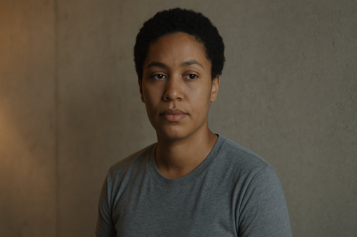
Skin is where texture lives or dies.
Everything above is craft. This is where it meets the only thing the audience stares at. A face. Grain a landscape into oblivion and nobody flinches. Do it to skin and the frame turns to plastic in one move. So here is the skin half of texture, built as a tool you can actually use.
First truth: skin is not a color, it is a range. Hue from yellow through orange to red, low to medium saturation, mid to high luminance, and an undertone that is the fingerprint. Find the range, protect it, texture around it. Tap a zone.
Expose for the skin, fix white balance in camera.
Two things wreck skin texture before the grade ever opens. Exposure and white balance. Skin wants to sit between 40 and 70 IRE. Drag the marker and watch what happens at the edges.
White balance is the other one, and wrong white balance is the hardest thing to fix later. Warm balance pushes skin yellow and red. Cool balance pushes it blue and pink. A gray card on set, match the practicals, and the grade becomes a polish instead of a rescue.
Protect the skin while you texture the frame.
The whole skin pass, in the order it runs. The last step is the one that kills skin if you get greedy. Tap any step to open it.
That last step is the whole reason this lives in the texture chapter. The eye reads clean, breathing skin as healthy and reads over-smoothed skin as fake before it can tell you why. Noise reduction takes the life out. Grain, kept off the reds of the face, puts it back. Remember the per-channel move from earlier: more grain in the cool background, less in the reds. The frame stays alive and the skin stays calm.
Different skin, different care.
One setting does not fit every face. The range moves with the complexion, and so does the thing you protect.
Skin under whatever light you get.
The light you shot in decides how hard the skin pass fights you. Tap a condition.
The skin pass, as a node tree.
Same idea as the look, drawn as nodes. Balance, expose, isolate the face, grade it, look on top, output. The one branch that matters for texture hangs off the end.
01
Balance
SCENE-REFERRED BASE
Clean signal first
02
Exposure
SKIN TO 40 TO 70 IRE
Expose for the face
03
Skin Isolation
QUALIFY AND WINDOW THE FACE
Touch only the skin
04
Skin Grade
UNDERTONE · ON THE LINE
Keep it natural
05
Look
THE CREATIVE ON TOP
After skin is safe
06
Output
DISPLAY TRANSFORM
Where it is going
07
NR / Texture
THE BRANCH · CLEAN, THEN GRAIN
Light NR, grain off the reds
That is the skin pass. Now zoom back out to the whole texture pipeline, the order everything rides in.
The order, said simple.
Here is the whole thing in the order it actually goes. No mystery.
Color management first, always. Then your look. Then shape the light, your contrast and your tonal structure, the part the last chapter beat into you. Now, and only now, the texture block.
Bloom and halation go in linear light, before the display transform, so they behave like physics and travel to every screen the same. Perceived-brightness compensation goes in where it earns its place, when you are pushing saturation hard enough that the brightness is running away from you. Then soften the image a touch. Then negative grain, early, log, scene-referred, one layer over the whole timeline. Then everything else you do. Then, dead last, after the display transform, print grain on the very top.
QC it on the scope so the numbers stay legal. But the eye is the judge. The scope tells you it is safe. Your eye tells you it is true. When they disagree about texture, you already know which one the audience is using.
01
Color Management
FOUNDATION · ALWAYS FIRST
Scene-referred base
02
Look
THE INTENT
Creative direction set
03
Shape Light
CONTRAST · TONAL STRUCTURE
The previous chapter's work
04
Bloom & Halation
LINEAR · BEFORE DISPLAY TRANSFORM
Behaves like physics
05
Perceived-Brightness Comp
WHEN SATURATION RUNS AWAY
Keeps brightness honest
06
Soften
SO GRAIN BECOMES THE EDGE
A touch, before grain
07
Negative Grain
EARLY · LOG · ONE LAYER
Scene-referred, whole timeline
08
Print Grain
DEAD LAST · ON TOP OF EVERYTHING
After the display transform
Nobody walks out of a theater talking about texture. They will tell you the shot felt warm, felt real, felt like they could touch it. They will never say the word. That is the job. Texture is the thing the audience feels in their hands and never names, and the day you stop being able to unsee it is the day your work starts to feel like film instead of looking like it.
The spine of this chapter follows Anna Hitova's Colour Training Masters 2024 thesis, The Art of Texture. The technical sourcing comes from the colorist community: liftgammagain, ACEScentral, Steve Yedlin's writing on resolution and sharpness, Mark Fairchild's color appearance work, and the Nayatani 1997 papers on the Helmholtz-Kohlrausch effect. The skin, exposure, and white balance discipline follows the working DaVinci Resolve skin tone pipeline, and the grain philosophy draws on Live Grain at livegrain.com: the right grain, at the right intensity, for the right image.